Are you new to the vast world of email marketing? Then you may have heard about landing pages and desperately wanted to ask the nearest marketing guru what the heck a landing page is but it was too awkward.
I get it. In the marketing world, it seems everyone already knows everything and you don’t want to bother people with your “newbie questions” (spoiler alert: we actually love it!).
Not on my watch! I’m going to show you everything you need to know about landing pages but were afraid to ask, including how to differentiate it from its long distance cousin the opt-in form.
You’ll be ready to create your first landing page and start collecting email subscribers!
What is a landing page?
Not gonna beat about the bush; a landing page is a specific page on your website focused exclusively on offering a freebie or lead magnet in exchange for people to subscribe to your email list.
Landing pages help you grow your email list faster, make your lead magnet more compelling and also make it easier for you to share about your lead magnet on social media.
Here’s the thing, a landing page is a page where any visitor only has two options: subscribe to your email list or leave. That’s what makes them so effective.
It also allows you to track key data points with more ease compared to using opt-in forms scattered throughout your site!
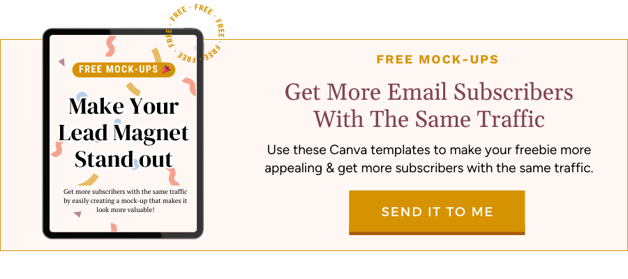
Want to know how to instantly make your landing page convert more of your visitors into email subscribers?
Download my lead magnet mock-up pack for free today and start getting more subscribers without needing more traffic.
Why are landing pages important?
You may find entrepreneurs, small business owners and even bloggers who only use opt-in forms in their website, and that may work for them.
However, the average conversion rate of an opt-in form is 2-5%. This means that out of every 100 visitors, 2-5 will join your email list. What about the other 95 visitors?! Alexa, play “The one that got away” by Katy Perry.
When you use landing pages instead, you’ll be able to convert more of those visitors into email subscribers. Like, a LOT more. Landing pages can convert anywhere between 30-75% of your visitors.
Why? Because of what I mentioned earlier. People only have the option to subscribe or leave. And if they got to your landing page, chances are they are interested and will sign up (yay!).

On top of that, because it’s a separate page with its own URL, you can easily share it online and so can your visitors if they LOVED your freebie.
For example:
I was recently featured on a podcast episode over at In The A.M. Branding and Alyssa, the host, included links below the show notes. One of them was a direct link to my landing page for my Mindset Makeover Challenge.
Anyone that tunes into that episode and checks out the links will have a chance to become my email subscriber. All because I had an easy link to share and I didn’t have to give complex instructions on how to locate a random opt-in form within my website.
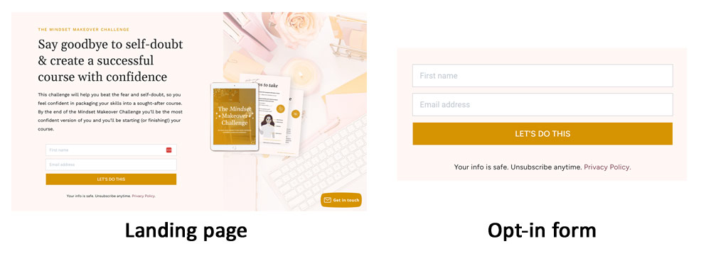
What’s the difference between a landing page and an opt-in form?
Don’t worry, I’m not going to hit you with the jargon.
A landing page is a page with an opt-in form inside. Boom . As simple as that. If you have a page that’s focused exclusively on promoting a lead magnet/freebie and nothing else, it’s a landing page.
If you are promoting a freebie or lead magnet within a blog post, on your sidebar, as a pop-up on your website, etc. it’s an opt-in form.
In general, if you can easily link to it without people having to look high and low for it, it’s a landing page!
What’s the difference between a landing page and a website page?
Another great question! A landing page is, by default, a page on your website. HOWEVER. There’s a key difference between a landing page and just about any other page on your website.
Your landing page should NOT have a menu, sidebar, or a complex footer.
It should only have the copy describing the lead magnet and the opt-in form, but no other distracting elements. You don’t want people getting distracted or clicking out of your landing page.
➡️ When they’re on your landing page, they have two options: subscribe or leave.
The only exception would be a very simple footer with your copyright and a link to your privacy policy or terms of service.
What’s the difference between a landing page and a sales page?
You’re on a roll with the fantastic questions, friend! This one should be easy to explain. A sales page IS another landing page, but the key difference is the user intention.
I just told you that someone viewing your landing page can only subscribe or leave, right? Well, when they are on a sales page, their only options are to buy or leave.
If you want to grow your email list, you use a landing page. If you want to sell a product, you use a sales page. The content and format are basically the same, but the sales page will have buttons leading people to a checkout instead of an opt-in form!
Okay, with that out of the way, let’s talk about what goes into a high-converting landing page!

Let’s see a few high-converting landing pages in action
So far, I’ve talked a lot about landing pages but if you’re still not sure what the heck it is, I don’t blame you.
In fact, when I first heard about landing pages my first thought was “ugh not another techy thing to set up”. Yep. That said, since landing pages convert SO much more, I quickly dismissed that thought and got on with creating a bunch of landing pages to grow my list quicker.
I’ve put together a few examples of high-converting landing pages below to help you get a better understanding of what they are and how to create your own.
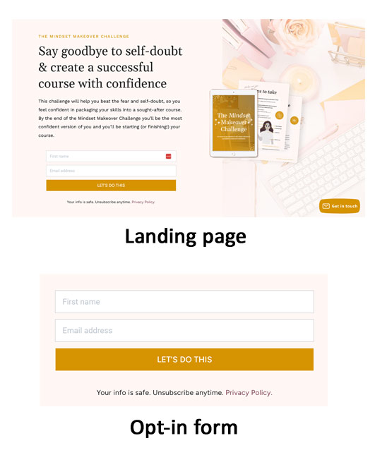
Example #1: Live training registration page
I designed this landing page for one of my amazing clients, Ela Thier at The Independent Film School. She hosts highly valuable free trainings on screenwriting, producing and film directing.

In this example, the landing page is a registration page for her free training on screenwriting.
You can see the main elements of the page:
1) The main promise of value: From Blank Page To Winning Screenplay
2) A few bullet points explaining what you’ll learn in the training
3) A big, bold and bright button so you don’t miss where to register
Below that, you have even more information and social proof from people who studied with the teacher. Anything below the main section isn’t necessary, but it might help seal the deal for a lot of people!
If your page has more than the main section, add buttons throughout so people don’t have to scroll back up to register.
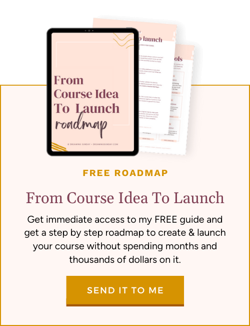
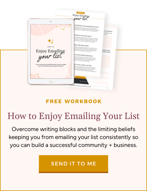
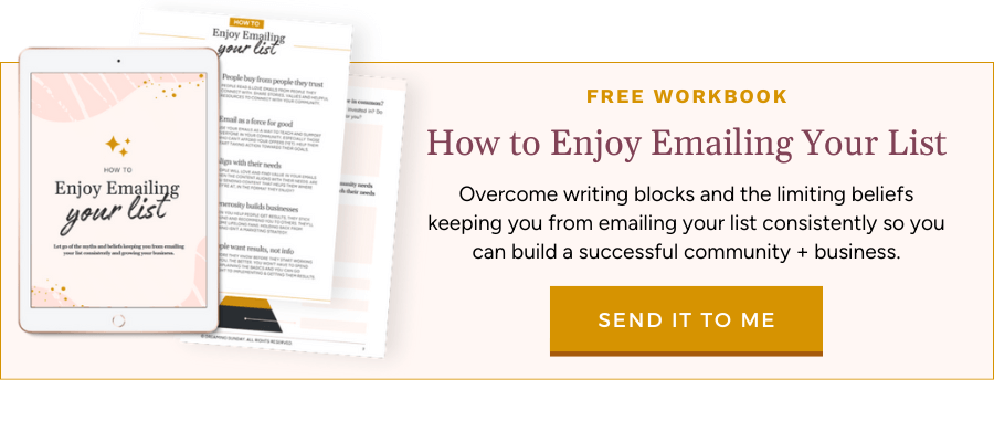
Example #2: A free PDF guide download
This is one of my own landing pages! When I ran Facebook ads to it, it had a 77% conversion rate. Or, in mortal terms, for every 100 people that clicked through from the ad, 77 would subscribe.
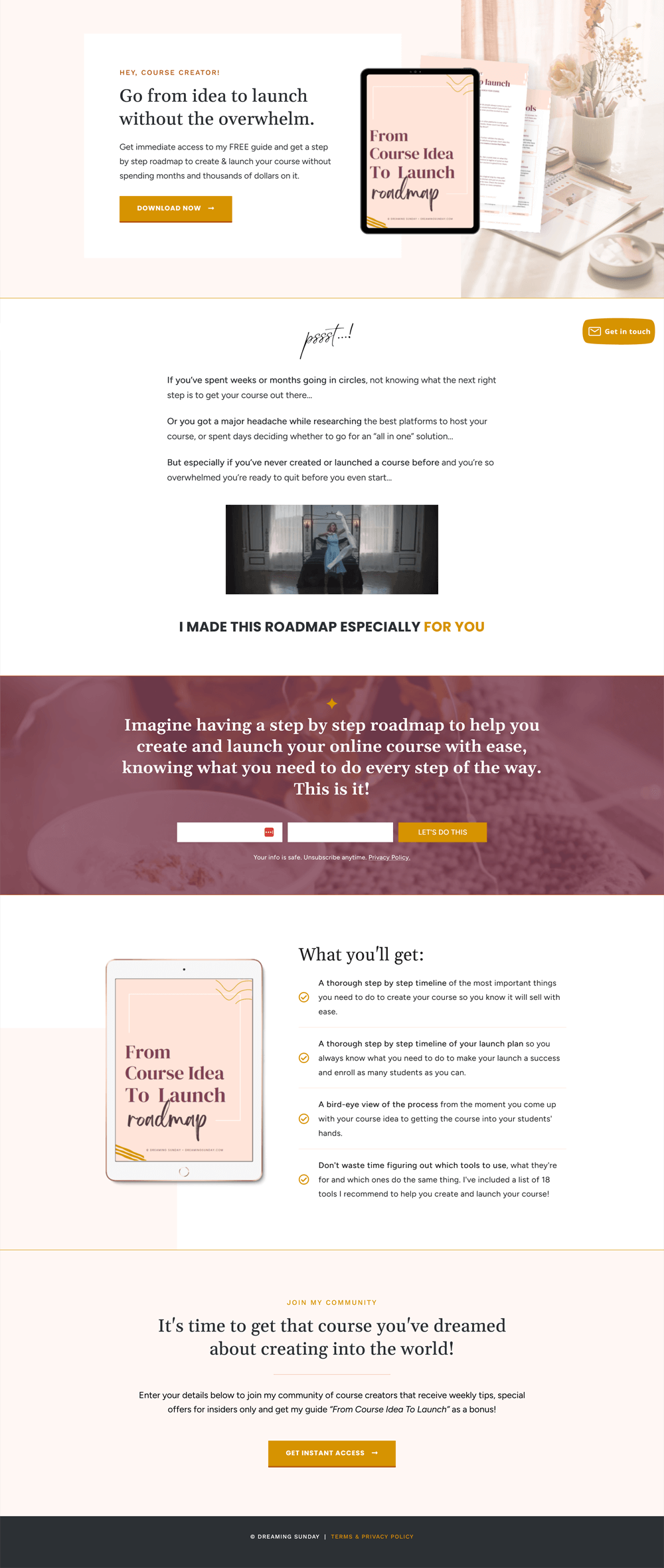
As you can see, it follows the same pattern as I mentioned earlier. We start with a big promise, go from course idea to launch without the overwhelm (who wouldn’t want that?!).
Then I share more about what they can expect to find in the guide if they download it.
The one difference compared to the other landing page is that because this is a PDF file, I was able to add a visual of it. By adding a mock-up of the guide, you make it look more appealing.
Here’s how you can create mock-ups for your own freebies and lead magnets:
And by the way, that is an opt-in form! 👆
Below all of that I included copy and graphics that describe how my ideal audience is feeling when it comes to launching their course. This helps them feel seen and like I can really help them fix it.
Finally I reinforce what they’ll get in the guide and add a few more places for them to opt-in to download it.
Example #3: A free on-demand masterclass
By now you’re probably starting to notice the patterns in these and why they work so well! This one is from Yes Supply, for a free on-demand training they offer.
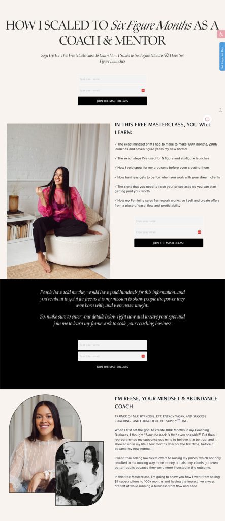
First thing you see is that big headline telling you straightaway what you’ll learn and why you should care. If you want to grow and scale your coaching business, this training is probably right up your alley.
Then we have a tagline reinforcing what’s in it for you, followed by an embedded opt-in form. It’s very easy to land on this page and quickly decide if this training is for you and sign up.
But, if you need more info, you can scroll down to access even more details about it, learn more about Reese and you have a few more opt-in forms so you can subscriber from anywhere on the page. Easy no?
If you want to join the training, you can check it out here (affiliate).
Over to you! How do you feel about using landing pages in your business now?
Do you feel you have a better idea of what a landing page is? And what the difference is between a landing page and an opt-in form?
I first launched Dreaming Sunday because I wanted to make things easier and simpler for new business owners, so they could take back their time (even if it’s only Sundays for now!). I hope this post helped simplify things for you and helped you realize why having a high-converting landing page can be your business’ biggest asset!
Do you still have questions? I’ve got you! You can leave a comment below or find me on social media, where I’m always happy to answer your questions.
–
Already have a landing page or want to get started with yours right away? Don’t forget to grab my pack of FREE lead magnet mock-ups so you can make your freebie 10x more appealing by having a visual of it on the page!