Are you spending a lot of money on ads to grow your list? Or creating content constantly to appease the Google ranking gods to keep your traffic up? What if you could get more email subscribers without spending more money on ads or time fighting Google’s algorithm? Let me show you how to do it by optimizing your landing pages to increase your conversions.
1. Why you want to increase your landing page conversion rate
Simple, to get more email subscribers with the same traffic. You wouldn’t pour water into a leaky bucket, would you? So why spend more money on ads, post on social media or create more SEO-friendly content when your landing page isn’t doing its job? 😉
Maybe it’s because I prefer designing things than playing with ads or spending hours on keyword research and content optimization but…
If I weren’t getting enough email subscribers, my first stop would be checking my landing page conversion rate. And only after confirming it’s doing well, would I move on to put the effort of outsmarting Google’s algorithm or giving more cash to Mr. Zuckerberg.
The “big” why, though? –> If you’re a coach, course creator or you sell digital products, growing your email list is key to driving consistent sales. You know you’re likely to get 1-5% of your email list to buy from you.
So it’s especially important for you to continue growing your email list to drive more sales and land more clients without overworking yourself or overspending on ads.
2. What is your landing page conversion rate?
You need to know your landing page’s conversion rate to know if it’s doing well or if it needs to be improved to get more subscribers from the same traffic.
How do you calculate your landing page conversion rate?
An easy way to calculate it is by dividing the subscribers you got form a specific lead magnet by the number of visitors the landing page received and then multiplying it by 100.
If you got 314 subscribers and the page got 1000 visitors:
(314/1000)*100 = 31.4% conversion rate
You can use lifetime data if it’s a new page or data from the last 30-90 days if it’s been around for a while.
What is a good conversion rate for an opt-in landing page?
While conversion rates vary by niche, season, offer, etc. in general you should aim to at least have a 10% conversion rate. However, those can be much higher and if you’re an infopreneur (aka you sell online courses or other educational content) or a coach, your conversion rates could go as high as 50-70%.
I recently redesigned all of the webinar registration landing pages for one of the 7-figure businesses* I work for and conversions increased to 55% for cold traffic and 70% for warm traffic.
If your lead magnet landing page conversion rate is not 10% or higher, keep reading!
* In case you’re wondering, they teach screenwriting and filmmaking (and they do an amazing job at it!).
Free guide
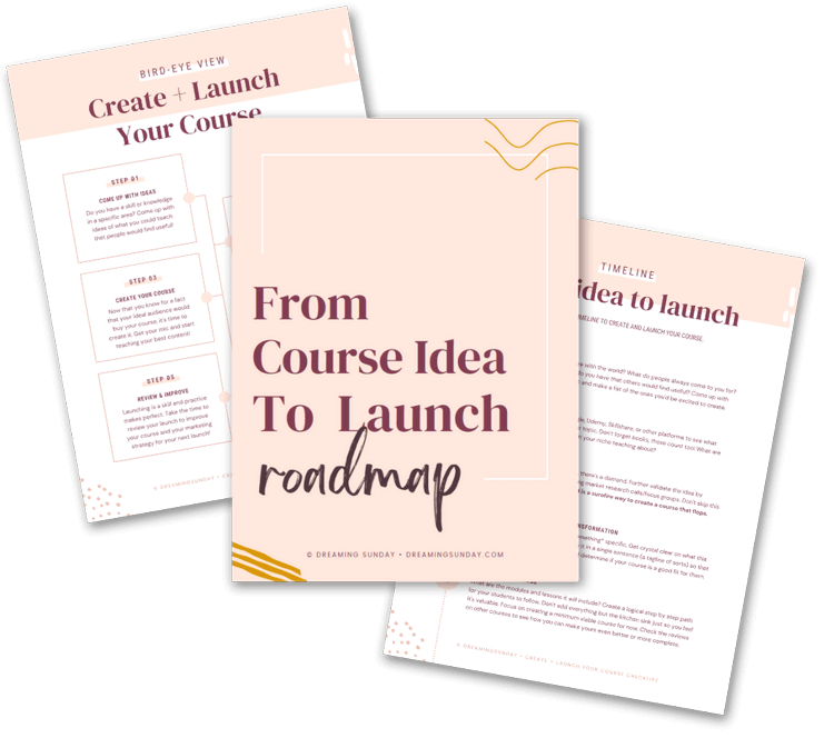
Go from course idea to launch with this step by step roadmap
3. Ways to boost your landing page conversion rate to get more subscribers with the same traffic
3.1 Have a big, bold headline focused on the problem your lead magnet solves for people
This is the first thing your potential subscribers will see when they land on your page. It’s often the deciding factor on whether they stick around or hit the ‘back’ button like their life depended on it.
Make sure it’s big, bold and super clear on what problem you’re solving for them. They’ll feel like they’re in the right place if you go straight to telling them what you can help them with.
What problem or pain point does your free lead magnet solve for them? Or begin to solve, if they need your course to completely fix the issue?
If you’re not fixing a problem, what aspiration or goal are you helping them achieve? How will their lives improve if they implement what you offer in your lead magnet?
Create a juicy headline that covers that in a clear and compelling way.
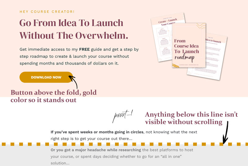
3.2 Keep your opt-in form or button above the fold
Most people won’t scroll down on your landing page. That’s the truth. Therefore you want to make sure that your opt-in form is above the fold.
Above the fold means what people see on their screen without scrolling down. Anything that requires scrolling down to be seen is “below the fold”.
Got a lot of copy to include on the page? Use two columns to include everything while keeping your button / opt-in form above the fold.
3.3 Make your opt-in form or button pass the squint test
This one’s a biggie! Once you’ve finished designing your landing page, step back and squint your eyes (or step even further).
➜ Can you still see easily and clearly where you need to click to trigger the opt-in form pop up?
If not, you need to make it bigger, brighter and make any other changes necessary to make it stand out so it’s unmissable. There has to be zero doubt in your visitor’s mind of where they need to click to take the next step.
This includes making sure the button looks clickable by avoiding pale colors that might make it look “inactive”.

Free guide
Go from course idea to launch with this step by step roadmap
3.4 Simplify your opt-in form, remove unnecessary fields
Opt-in forms often give you a lot of options for what information you can collect form your subscribers, which can be a blessing and a curse.
The more fields your subscribers have to fill out to subscribe, the less likely they are to complete it. Each unnecessary field you ask for is a chance for them to second-guess their decision and exit the page instead.

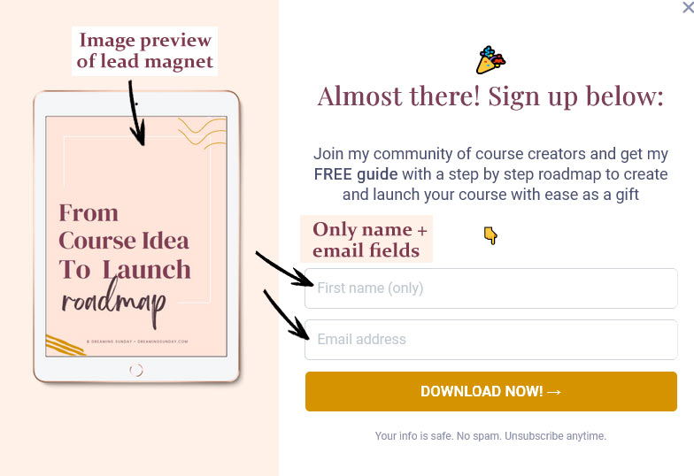
Only ask for a first name (only!) and an email address whenever possible. You can have a checkbox for GDPR purposes. However, you want to avoid anything else you don’t strictly need or can’t get after they’re on your email list.
You also want to keep the form simple and not include a lot of copy. Keep the form clean and your visitors focused on the two fields they need to fill out.
3.5 Include an image preview or mock-up of the lead magnet
Are you giving them a free guide? Checklist? Mini-course? Whatever it is, create a preview or a mock-up of your lead magnet and include it in your landing page.
Featuring a preview of your lead magnet is proven to increase conversions. Seeing what they’re going to get if they sign up will entice them to complete the process and subscribe.
You can create a preview or a mock-up of your lead magnet using Canva.com (it’s free!).
Or download my FREE lead magnet template pack and start getting more subscribers from your lead magnets 😉
![[FREE] Lead Magnet Previews Mock-ups (vertical) - Dreaming Sunday](https://dreamingsunday.com/wp-content/uploads/2023/12/FREE-Lead-Magnet-Previews-Mock-ups-vertical-Dreaming-Sunday.png)
Free template pack
Supercharge your landing pages + opt-in forms with these lead magnet mock-up templates
3.6 Remove distractions from your landing page like menus, sidebars or footers
A landing page isn’t just another page on your website. Its one and only goal is to get people to subscribe to your email list or leave.
To make sure that’s the case, it must not have any distractions including menus, sidebars, footers or external links. Don’t let them get distracted by anything or else they’ll leave without subscribing, oops.
The only exception would be a very plain footer that simply lists your copyright and a link to your privacy policy or terms of service (for obvious legal purposes).
Over to you! How will you Optimize your landing page conversion rate?
There are so many other ways to go about increasing your landing page conversion rates, but for me, these make the biggest impact.
Everytime I design a new page, I do so with these in mind so I know the page will convert really well. Of course, everything depends on your lead magnet. An amazing landing page can’t do squat if you’re offering the wrong thing to the wrong people.
But I’m assuming you know your audience and you’ve got that part down 😉 Otherwise, stay tuned. I’ll have more tips to help you with that soon.
TAKE ACTION:
My challenge to you now is to go calculate your lead magnet landing page conversion rate, implement a few of the tips above (or all!) and come back to let me know how your page is performing with the changes!
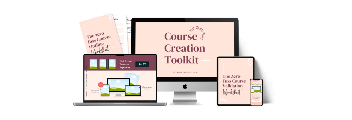
Quickly create your online course with customizable, done-for-you resources.
Get access to lesson presentation templates, guided webinar slide-decks, workbook templates, plug & play launch plans, pricing calculators, course name + tagline generators, social media graphics pack, and more!

It can be difficult to write with a "beginner's mind" when you're super experienced, and you master this so well. Absolutely love your writing style and how you've structured this post.
Thank you so much, Gigi! It means a lot coming from you 🙂